K-Means is an unsupervised machine learning algorithm that partitions data into k distinct clusters. Each data point belongs to the cluster with the nearest mean (centroid). The algorithm works iteratively: (1) initialize k centroids randomly, (2) assign each point to the nearest centroid, (3) recalculate centroids as the mean of assigned points, and (4) repeat until convergence.
In this notebook, we apply K-Means to a mall customers dataset to segment shoppers based on their annual income and spending score.
import pandas as pddf = pd.read_csv('datasets/mall_customers/Mall_Customers.csv')df.head()
/tmp/ipykernel_2050756/2628508463.py:4: FutureWarning: Downcasting behavior in `replace` is deprecated and will be removed in a future version. To retain the old behavior, explicitly call `result.infer_objects(copy=False)`. To opt-in to the future behavior, set `pd.set_option('future.no_silent_downcasting', True)`
  df['gender'] = df['gender'].replace(['Female', 'Male'], [0,1])
df
customer_id
gender
age
annual_income
spending_score
0
1
1
19
15
39
1
2
1
21
15
81
2
3
0
20
16
6
3
4
0
23
16
77
4
5
0
31
17
40
...
...
...
...
...
...
195
196
0
35
120
79
196
197
0
45
126
28
197
198
1
32
126
74
198
199
1
32
137
18
199
200
1
30
137
83
200 rows × 5 columns
Choosing k: The Elbow Method
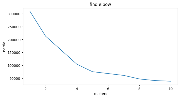
The elbow method helps determine the optimal number of clusters (k). We run K-Means for a range of k values (e.g., 1 through 10) and compute the inertia (sum of squared distances from each point to its assigned centroid).
As k increases, inertia decreases — because clusters become smaller and tighter. The goal is to find the “elbow point” where the rate of decrease sharply changes, indicating that adding more clusters yields diminishing returns.
Below we calculate inertia for k = 1 to 10 and plot the results to visually identify the elbow.
from sklearn.cluster import KMeansX = df.drop(['customer_id', 'gender'], axis =1)clusters = []for i inrange(1,11): km = KMeans(n_clusters = i).fit(X) clusters.append(km.inertia_)
Visualizing and Interpreting Clusters
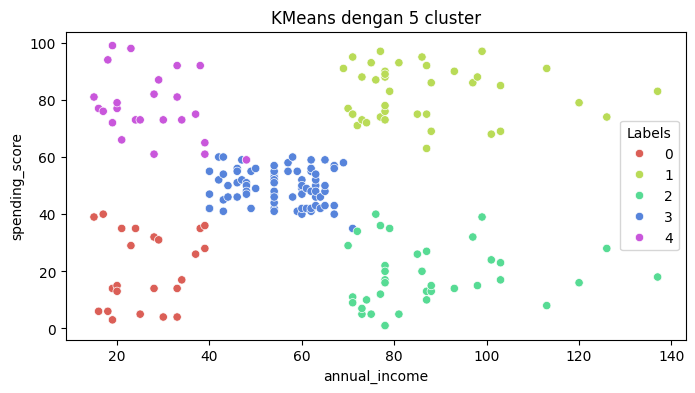
Once we’ve chosen k (here, k = 5 based on the elbow plot above), we fit a final K-Means model and assign cluster labels to each data point.
The scatter plot below visualizes customers colored by their cluster assignment, using Annual Income on the x-axis and Spending Score on the y-axis. Each cluster represents a distinct customer segment: